Планшет: проекты и карта на первом экранеTablet: projects and the map on the first screen
· Открыть на сайтеOpen on the site
ЦельGoal
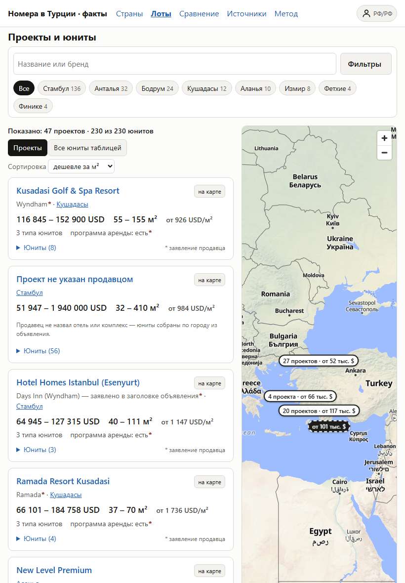
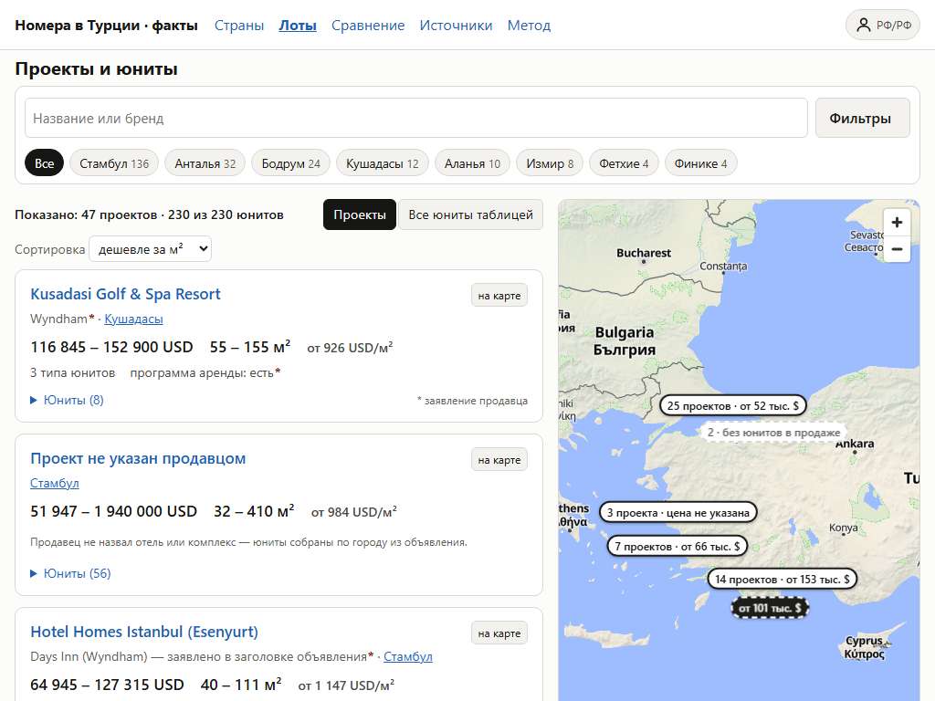
Инвестор, который открывает каталог на планшете, сразу видит предложения — карточки проектов и карту, а фильтры открывает, когда они нужны.An investor opening the catalogue on a tablet sees the offers at once — project cards and the map — and opens the filters when needed.
ЗадачаProblem
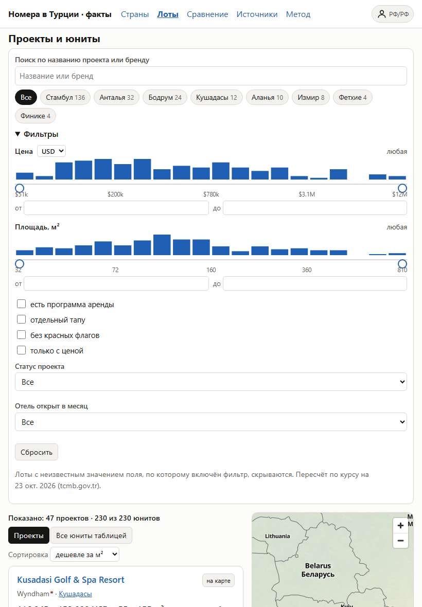
На ширине 760–1099 px (iPad, небольшие ноутбуки) панель фильтров была раскрыта на всю ширину: гистограммы цены и площади, флажки, списки — около 890 px. На iPad 820×1180 первая карточка проекта начиналась почти внизу экрана. На телефоне фильтры уже были свёрнуты в кнопку, на широком экране стояли колонкой слева — планшет остался без решения.At 760–1099 px (iPad, small laptops) the filter panel was open across the full width: price and area histograms, checkboxes, lists — about 890 px. On an 820×1180 iPad the first project card started near the bottom of the screen. On a phone the filters were already a button, on a wide screen a left column — the tablet had been left out.
Как решилиHow it was solved
- На планшете — как на телефоне: поиск и кнопка «Фильтры» в одной строке, чипы городов под ними; панель свёрнута, пока её не откроют.On a tablet — as on a phone: search and a «Filters» button on one row, city chips under them; the panel stays collapsed until opened.
- В раскрытой панели внизу — «Показать N проектов»: закрывает фильтры и возвращает к списку.The open panel has «Show N projects» at its bottom: it closes the filters and goes back to the list.
- Итог: блок фильтров 886 → 144 px (768–820 px) и 828 → 108 px (1024 px); карточки и карта — на первом экране.Result: the filter block 886 → 144 px (768–820 px) and 828 → 108 px (1024 px); the cards and the map are on the first screen.
До и послеBefore and after