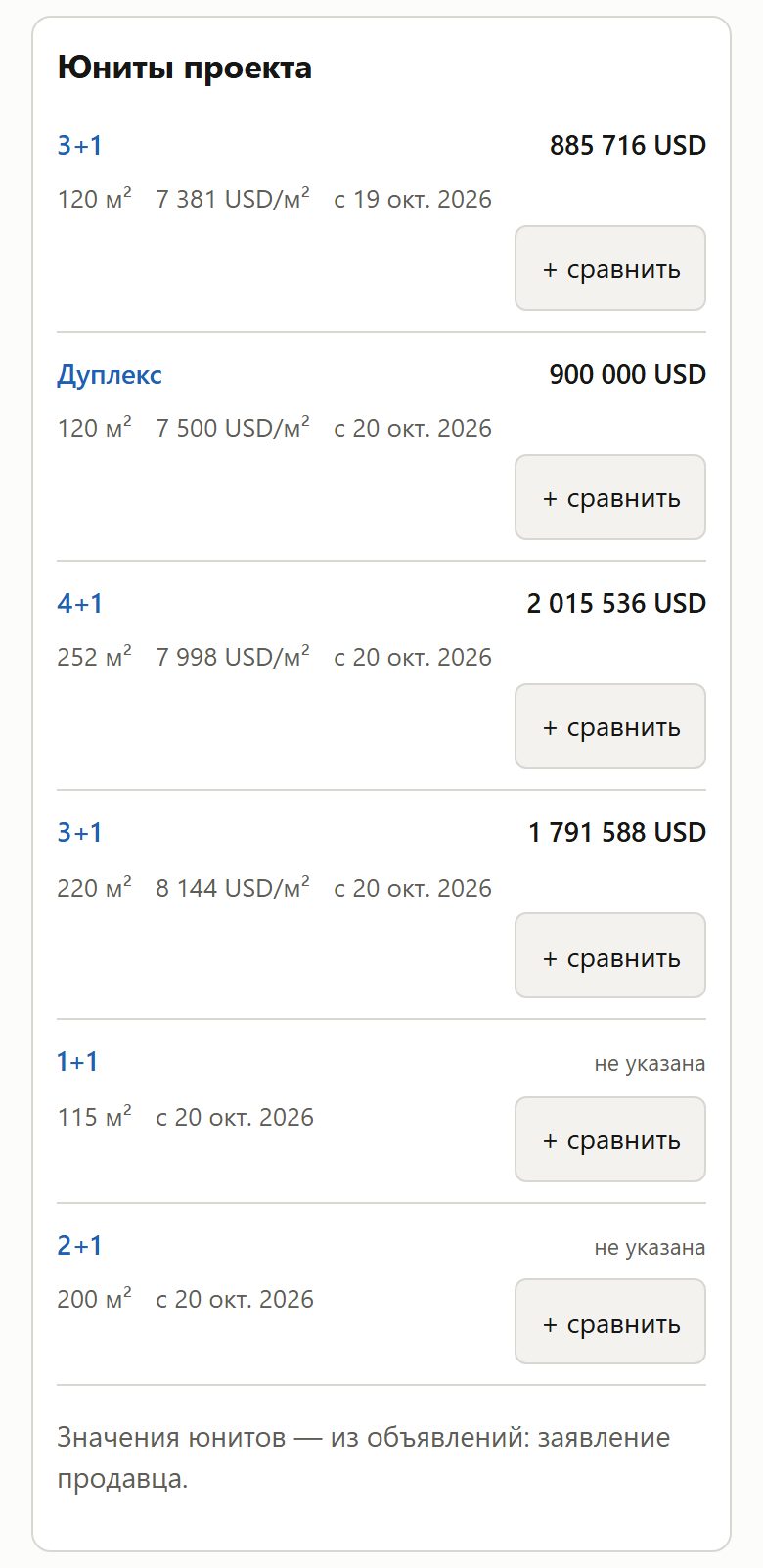
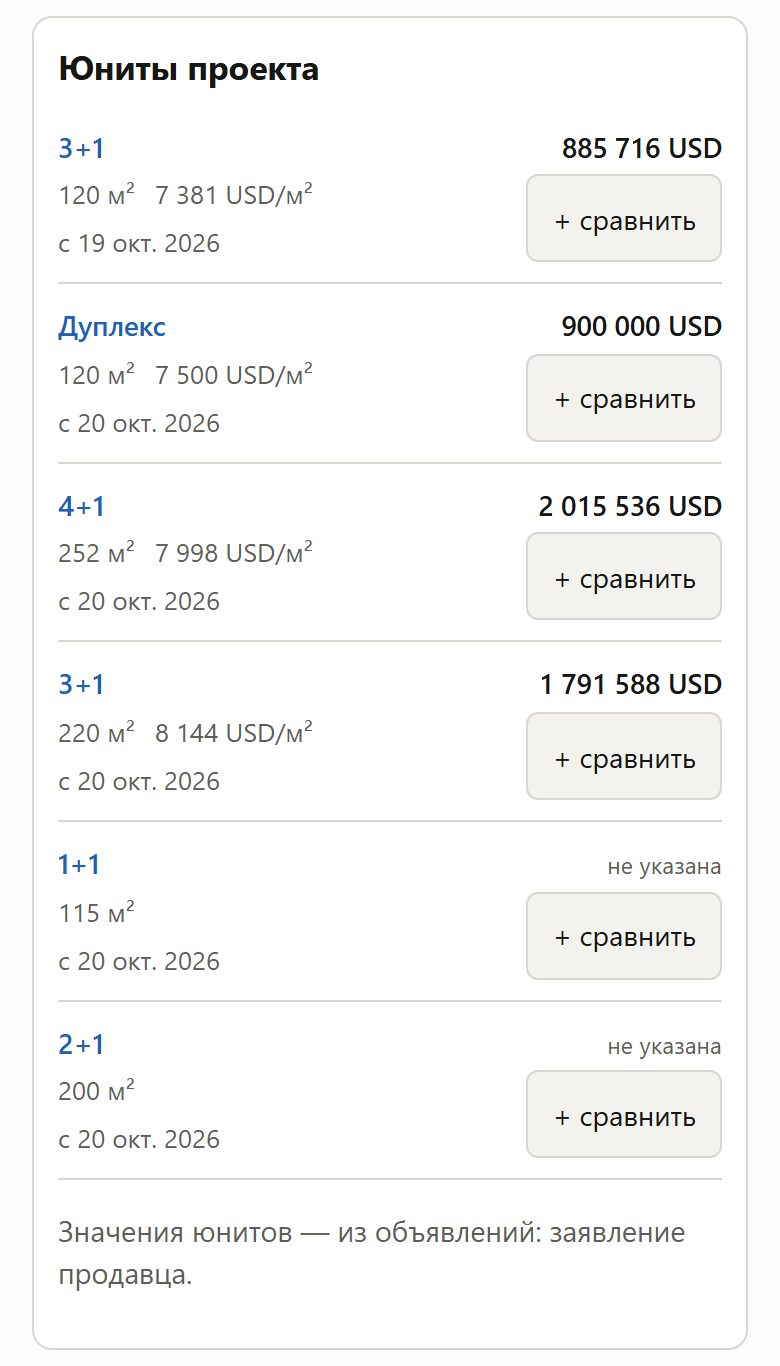
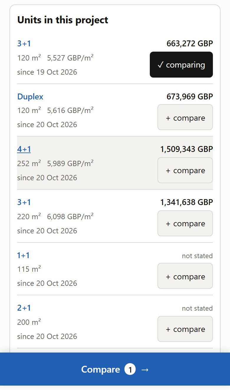
На телефоне «+ сравнить» стоит рядом с площадью, а не отдельной строкойOn the phone «+ compare» sits beside the area, not on a line of its own
· Открыть на сайтеOpen on the site
ЦельGoal
Инвестор листает юниты проекта на телефоне и сравнивает их по площади и цене за м². Чем короче строка юнита, тем больше юнитов на одном экране и тем меньше листать.An investor scrolls a project's units on the phone and compares them by area and price per m². The shorter a unit row, the more units fit on one screen and the less there is to scroll.
ЗадачаProblem
Площадь, цена за м² и дата занимали всю строку, и кнопке «+ сравнить» не хватало места: она уходила отдельной третьей строкой под ними, а справа от фактов оставалась пустота. Так было у 581 из 682 юнитов на страницах проектов, каждая такая строка выше на 23 px. На Swissôtel Living Bodrum список из шести юнитов занимал 785 px.The area, price per m² and date took the whole line, and «+ compare» had no room: it went to a third line of its own below them, with empty space to the right of the facts. That was so for 581 of 682 units on the project pages, each such row 23 px taller. On Swissôtel Living Bodrum the list of six units took 785 px.
Как решилиHow it was solved
- Строка юнита на телефоне — две колонки: слева тип, площадь и цена за м², под ними этаж и дата; справа цена и под ней «+ сравнить» на уровне площади.A unit row on the phone has two columns: on the left the type, area and price per m², under them the floor and date; on the right the price and, under it, «+ compare» level with the area.
- Так везде, где есть строки юнитов: страница проекта, юниты в карточках города и каталога, «Другие юниты проекта» на странице юнита, вид «Юниты» каталога. После нажатия «✓ в сравнении» кнопка остаётся на месте, строка не растёт.The same wherever unit rows appear: the project page, units in the city and catalogue cards, «Other units of the project» on a unit page, the catalogue's «Units» view. After a tap «✓ comparing» stays in place and the row does not grow.
- Итог: кнопка под фактами — у 0 из 682 юнитов на 320–414 px (было 542–634). Строки Swissôtel — 90 px вместо 117, список — 667 px вместо 785. Во всех списках юнитов на 390 px — на 40 тыс. px короче.Result: the button is below the facts for 0 of 682 units at 320–414 px (was 542–634). Swissôtel rows are 90 px instead of 117, the list 667 px instead of 785. All unit lists at 390 px are 40 thousand px shorter.
- Цена: у четырёх юнитов с пометкой «цены расходятся» пометка теперь под ценой, их строка в карточках выше на 15 px. На компьютере таблица прежняя.The cost: for four units marked «prices disagree» the mark now sits under the price, and their row in the cards is 15 px taller. On a computer the table is unchanged.
До и послеBefore and after