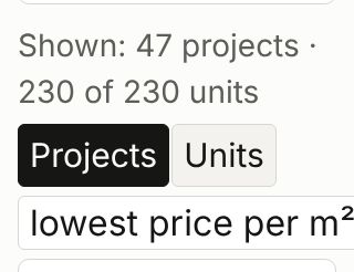
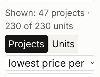
«Сортировка» при крупном тексте — без прокрутки вбок«Sort» with large text — no sideways scrolling
· Открыть на сайтеOpen on the site
ЦельGoal
Инвестор на узком телефоне, у которого в браузере текст увеличен вдвое, видит список «Сортировка» с его стрелкой в пределах экрана, и каталог не прокручивается вбок.An investor on a narrow phone whose browser shows text at double size sees the «Sort» list with its arrow within the screen, and the catalogue does not scroll sideways.
ЗадачаProblem
Список «Сортировка» был шириной в самый длинный свой вариант («highest price per m²»). При тексте 200 % на экране 320 px на английской главной и /lots/ он был шире экрана, и страница становилась шире экрана на 38 px — с мышью и на сенсорном экране; стрелка списка была за краем. На русских страницах и с 375 px переполнения не было.The «Sort» list was as wide as its longest option («highest price per m²»). With text at 200 % on a 320 px screen, on the English home page and /lots/ it was wider than the screen, and the page became 38 px wider than the screen — with a mouse and on a touch screen; the list's arrow was past the edge. On the Russian pages and from 375 px there was no overflow.
Как решилиHow it was solved
- Список «Сортировка» не шире строки. При тексте 200 % (320, 375, 641, 768 и 1024 px, русский и английский, с мышью и на сенсорном экране) главная и /lots/ не шире экрана, стрелка списка видна.The «Sort» list is no wider than its row. With text at 200 % (320, 375, 641, 768 and 1024 px, Russian and English, with a mouse and on a touch screen) the home page and /lots/ are no wider than the screen and the list's arrow is visible.
- На 320 px при тексте 200 % в английском списке видно «lowest price per» — «m²» обрезано (раньше «m²» было видно, но стрелка была за краем экрана). При обычном размере текста ничего не изменилось: ширина и высота страниц те же.At 320 px with text at 200 %, the English list shows «lowest price per» — «m²» is cut off (before, «m²» was visible but the arrow was past the edge of the screen). At normal text size nothing changed: page widths and heights are the same.
До и послеBefore and after