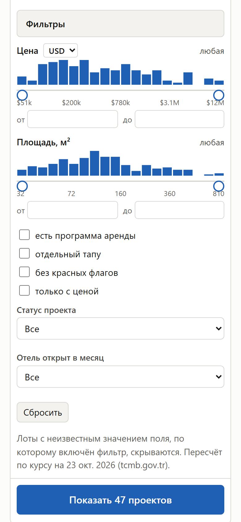
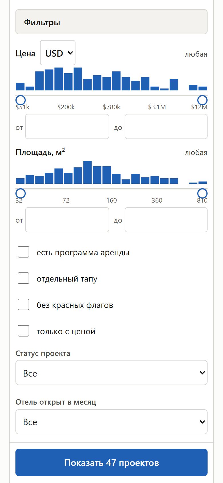
Размеры касания на телефоне: 44 px и шрифт 16 pxPhone touch sizes: 44 px and 16 px text
· Открыть на сайтеOpen on the site
ЦельGoal
Инвестор на телефоне задаёт бюджет и условия в фильтрах и открывает источники фактов пальцем с первого раза — без промахов и без того, чтобы страница сама увеличивалась.An investor on a phone sets a budget and conditions in the filters and opens fact sources with a thumb on the first try — no misses and no page zooming in by itself.
ЗадачаProblem
В панели фильтров на телефоне выбор валюты был 23 px в высоту, поля «от / до» — 28 px, «Статус» и «Месяц» — 36 px, строки флажков — 28 px; шрифт в полях 13–15 px — iPhone при нажатии на такое поле увеличивает страницу. Кнопки «i» с источником факта — 28×28 px, хлебные крошки — 30 px. Ориентир для пальца — 44 px (Apple HIG, taste-skill).In the phone filter panel the currency picker was 23 px tall, «from / to» fields 28 px, «Status» and «Month» 36 px, checkbox rows 28 px; field text was 13–15 px — an iPhone zooms the page when such a field gets focus. The «i» fact-source chips were 28×28 px, breadcrumbs 30 px. The target for a thumb is 44 px (Apple HIG, taste-skill).
Как решилиHow it was solved
- Поля и списки в фильтрах, «Мои параметры», сортировка и выбор города в сравнении — 44 px в высоту и шрифт 16 px: страница больше не увеличивается при вводе.Fields and pickers in the filters, «My details», the sort and the compare city picker — 44 px tall with 16 px text: the page no longer zooms in when typing.
- Строки флажков и «Таблица» под графиками — 44 px, флажок 20 px.Checkbox rows and «Table» under the charts — 44 px, the checkbox 20 px.
- У кнопок «i» и хлебных крошек зона нажатия больше видимой (до 44 px в высоту), а выглядят они как раньше. Страницы на 320 px не стали шире экрана.The «i» chips and breadcrumbs have a tap area larger than they look (up to 44 px tall) and look as before. Pages at 320 px did not get wider than the screen.
До и послеBefore and after